“The Long Island Rail Road (LIRR) is the busiest commuter railroad in North America, carrying approximately 200,000 customers each weekday on 947 daily trains.” (LIRR website) As one of the most popular commuter rail systems, the Long Island Rail Road (LIRR) should be expected to offer digital products that meet the high demands of its users. However, this is not the case. Essential tasks like browsing schedules, booking trips, and purchasing tickets require people to download the LIRR app—a solution that may not be convenient for everyone.
Goal
I set out to redesign the current LIRR website to eliminate the need for travelers to download the separate app. By making all essential actions accessible directly from the website, this redesign would benefit commuters in a rush to catch their train, those without smartphones, and individuals with limited data or storage. From my own experience, I’ve incurred additional costs from purchasing tickets onboard because I couldn't buy one quickly through the website.

What are people’s experiences with the Long Island Rail Road?
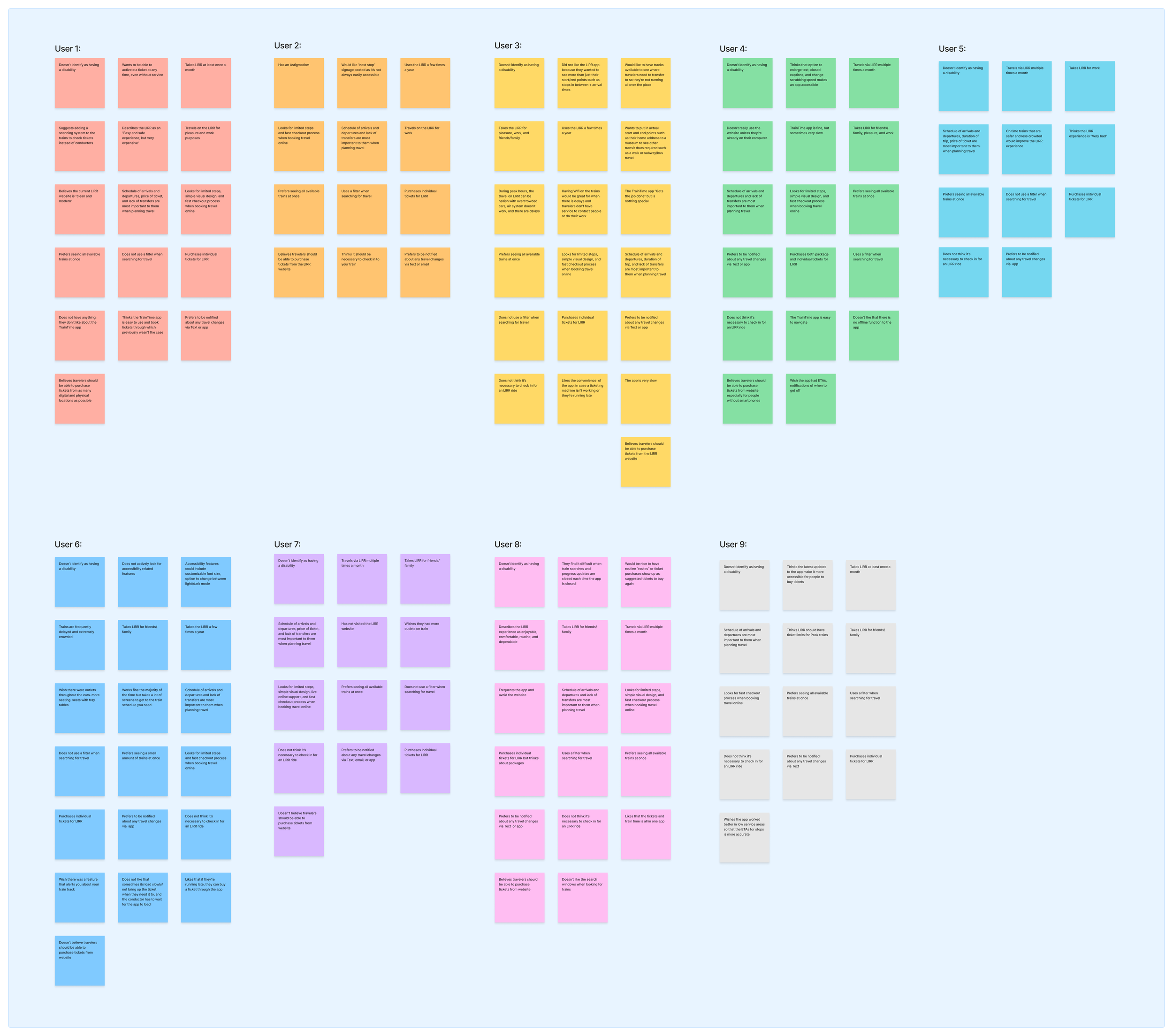
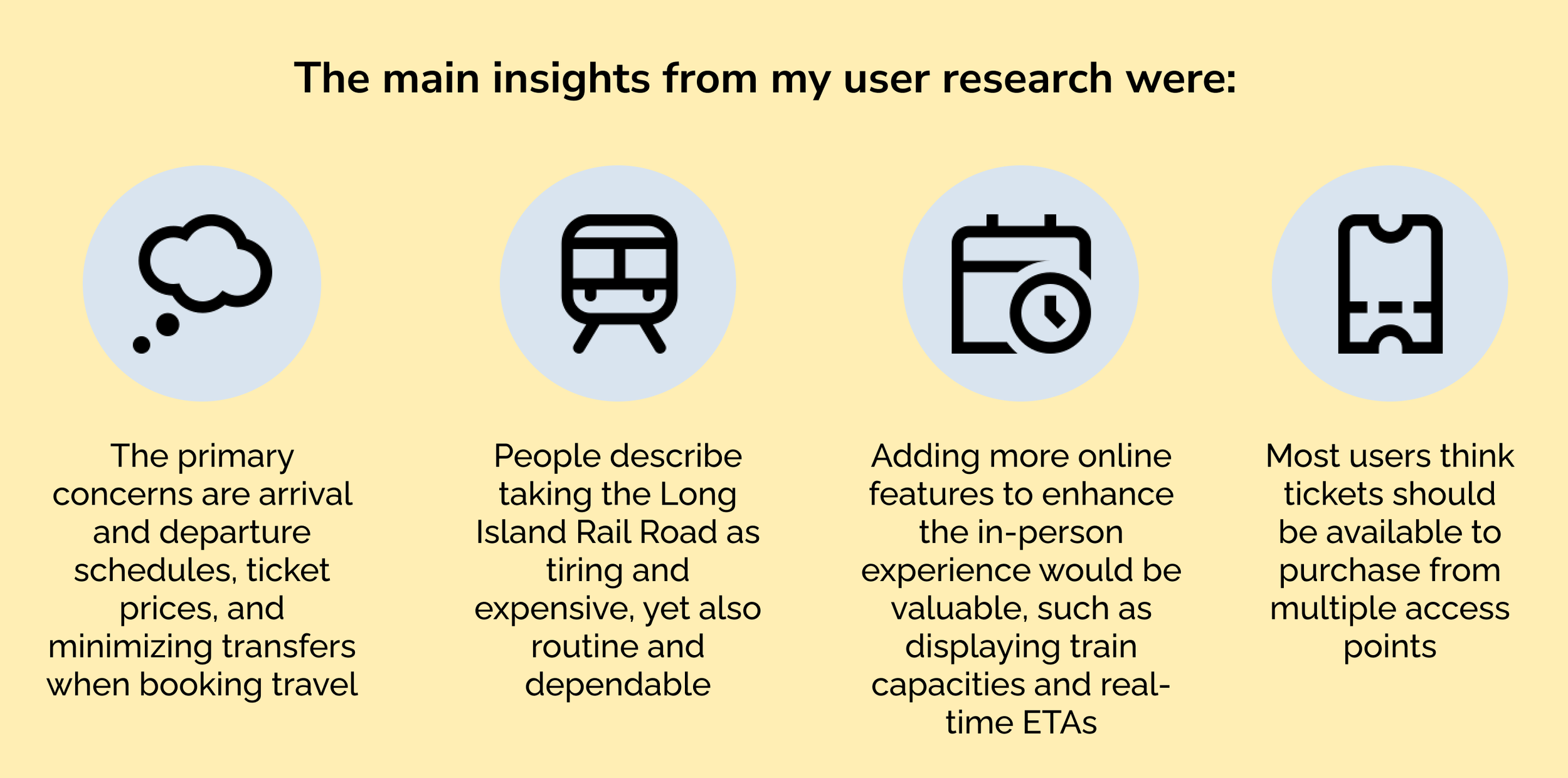
I interviewed nine LIRR travelers to gather insights on how they plan their trips and their experiences with the LIRR website and app. The feedback provided valuable suggestions, including the desire for an option to reserve seats in advance, as well as frustration over the inability to purchase tickets directly from the website. It seemed as though other people shared my sentiment of wanting the website to have more capabilities.
Why improve the website?
What would enhance the LIRR website?
I developed a feature roadmap to outline the key elements for my redesign, categorizing them from essential features to desirable, but non-essential, additions. This roadmap was informed by my user research, competitive analysis, and an evaluation of the current website. It served as my north star throughout the design process, helping me stay focused on the core objectives and ensuring I included the right features to achieve my goal of enhancing the website
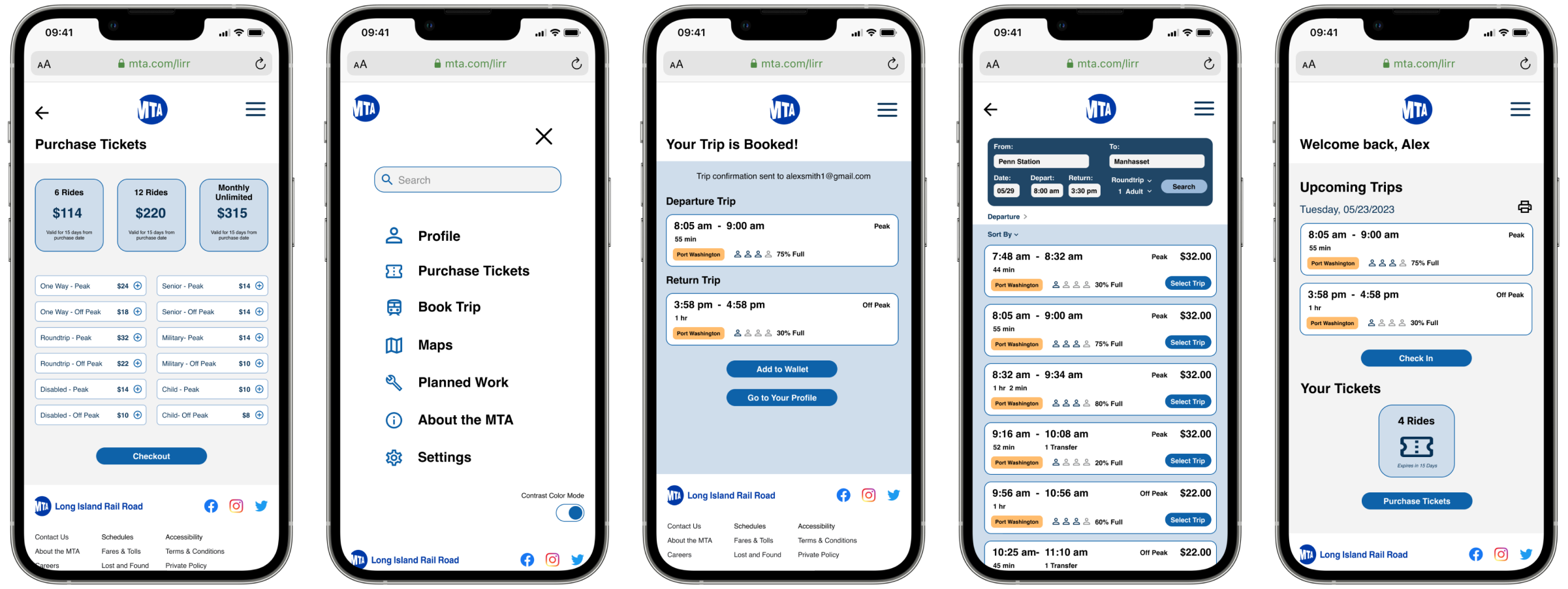
I focused on three key tasks for the redesign: purchasing tickets, searching for trains, and checking in. For each task, I created user and task flows, aiming to replicate the ease and satisfaction I experienced on competitor sites. One of the main concerns raised by survey participants was the need for a streamlined process with fewer steps when searching for and booking travel. I made it a priority to address this feedback by simplifying these workflows to ensure a more efficient and user-friendly experience.
Since my primary focus was improving the structure and functionality of the website, I opted to retain the existing visual design with minimal changes. I always found the blue used as the LIRR secondary color appealing, so I decided to build a monochromatic color scheme around it. By featuring this blue, rather than the current black and white, the design feels brighter, more approachable, and fosters a sense of trustworthiness.
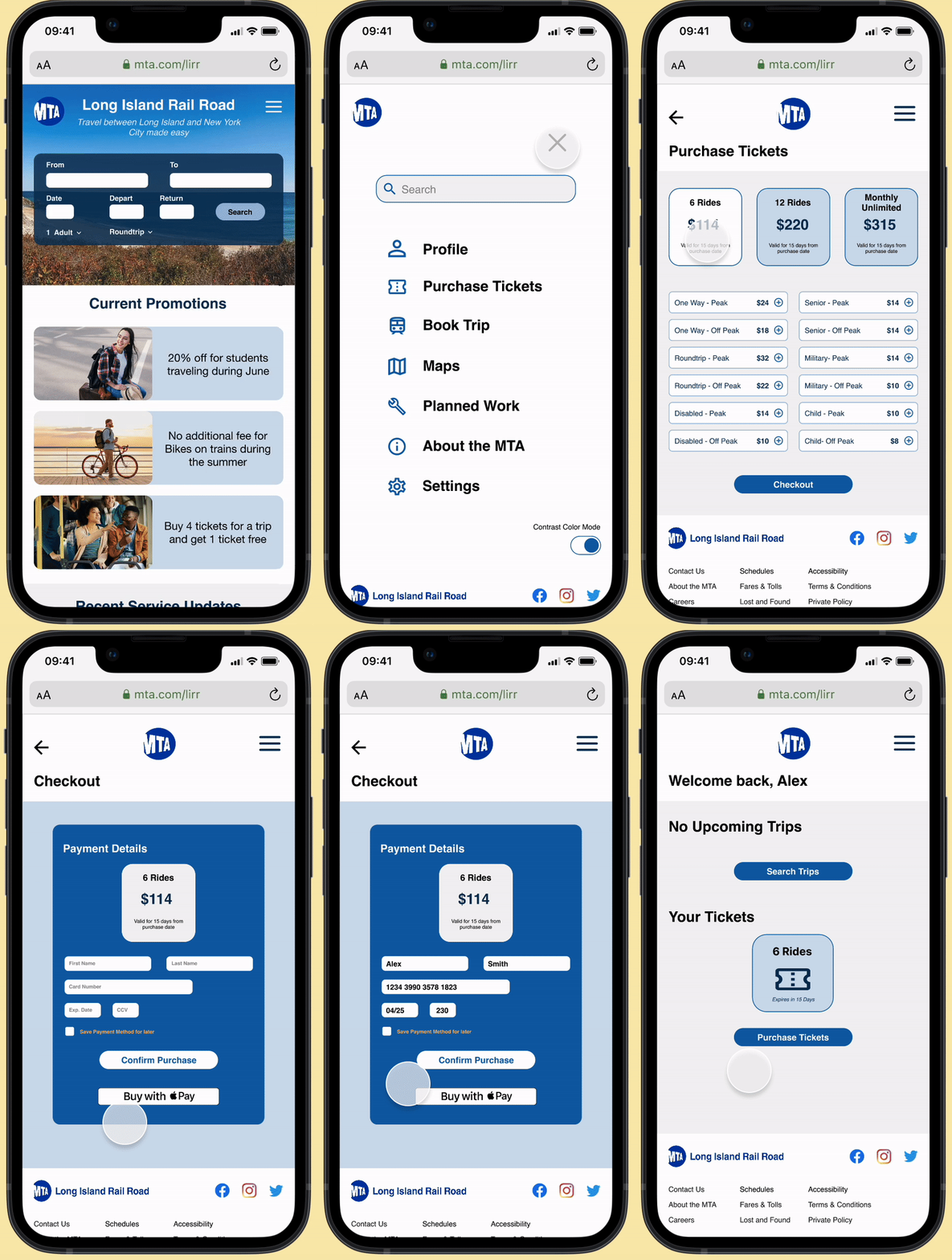
Another visual change I made was making the search feature the central focus of the homepage, as finding a train is the primary task for most users. Placing it front and center, similar to other travel sites, guides users directly to what they need.
How does my redesign resonate with LIRR travelers?
Fifteen LIRR travelers participated in the usability test of my redesign, providing valuable feedback on how to improve content hierarchy, enhance the booking experience, and refine other aspects of the interface for better accuracy and functionality.
After the usability tests I made several improvements, including adding Apple Pay as a payment option, incorporating confirmation messages after completing tasks, and reorganizing sections on the homepage. Overall, users expressed satisfaction with the redesign, noting that the process felt intuitive and that it provided a more seamless web experience, eliminating the need to download the app.
The purpose of a LIRR redesign
LIRR riders should be able to visit the website and complete all essential travel tasks without needing to download an app. Without these key features, the website doesn’t have much value. The LIRR is underutilizing the website, resulting in an inefficient and unsatisfactory experience for users. My redesign resolves this issue.
Meet Charles and Miranda, two LIRR travelers with unique challenges. Charles, a Long Island resident, takes the LIRR every Saturday to visit his grandchildren in Manhattan. His biggest frustration is not having a smartphone, which prevents him from using the LIRR app. While he can purchase tickets at the ticket booth, it’s often out of service, leaving him with no choice but to pay a higher fare on the train. Miranda, 22, works in insurance and commutes from Brooklyn to Long Island for a monthly in-person meeting at her company's office. As an internet obsessed Gen-Z, she struggles with limited phone storage, making it difficult and annoying to download and then delete the LIRR app every month for her trip. She enjoys using her train ride to unwind, but only finds it relaxing if she secures her ticket before her trip.


